Unit 3 - Branding and Logo Design
Logos can evoke immediate associations with companies or specific products. Organizations and corporations use logos to identify themselves and set up brands. A logo should be unique, functional, and versatile. In this project, students view sample logos and discuss color theory and design principles used in the logos. Students plan, create, and build a logo for use in other publications, such as business cards, menus, or advertisements. Students learn about file formats, resolution, and image size and select appropriate settings for a variety of final product scenarios. (Adobe, 2012)
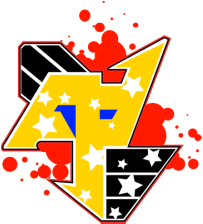
See Gallery of Student Logos Here.
Logos can evoke immediate associations with companies or specific products. Organizations and corporations use logos to identify themselves and set up brands. A logo should be unique, functional, and versatile. In this project, students view sample logos and discuss color theory and design principles used in the logos. Students plan, create, and build a logo for use in other publications, such as business cards, menus, or advertisements. Students learn about file formats, resolution, and image size and select appropriate settings for a variety of final product scenarios. (Adobe, 2012)
See Gallery of Student Logos Here.
Project Objectives and Skills:
These are the things you are learning to do and create in this unit. It goes beyond a great image. You are making so much more!
These are the things you are learning to do and create in this unit. It goes beyond a great image. You are making so much more!
|
Project management skills
• Planning and creating a logo • Managing and organizing graphics elements and illustrations Design skills • Understanding and employing design principles • Understanding and employing color theory • Sketching, brainstorming, and refining ideas • Creating and editing graphical elements and illustrations • Designing for a specific audience and purpose |
Research and communication skills
• Investigating logos • Critiquing designs • Communicating purpose and goal • Communicating and presenting design decisions • Giving feedback on a project Technical skills • Understanding the Adobe Illustrator workspace • Creating vector artwork • Drawing lines • Drawing and modifying shapes • Using gradients |
|
Key Vocabulary
Logos: Branding Brand Message French Curves Creative Process: Brainstorming Variations |
Adobe Illustrator: Shape Builder Stroke, Fill, and Gradient Workspace Tools (Pen, Pencil, Shapes, Warp, Pencil, Pen, Warp, Smooth) Panels (Layer, Gradient, Transparency, Tool, Graphic Styles, Appearance) Transparency Blending Mode Paper Sizes |
Daily Plans:
The Personal Logo Project is a 16 day unit. You will have several assignments throughout the 16 days. If you miss a day, you can see below what you may have missed.
The Personal Logo Project is a 16 day unit. You will have several assignments throughout the 16 days. If you miss a day, you can see below what you may have missed.
|
Day 1 - First Day of the Term (Feb 3)
I can explore how companies use logos to communicate an abstract message.
Day 2 - Brainstorming (Feb 4) I can brainstorm ways to communicate
Day 3 - Work on Idea Variations (Feb 5) I can understand HOW I draw a symbol affects the meaning of my message.
Day 4 - Work on Idea Variations (Feb 6) I can understand HOW I draw a symbol affects the meaning of my message.
Day 5 - Draw on Graph Paper (Feb 7) I can create a well crafted logo that communicates something about myself.
Day 6 - Workday (Feb 10) I can create a well crafted logo that communicates something about myself.
Day 7 - Introduce Drawing Tools (Feb 11) I can use color to help me communicate my ideas.
Day 8-9 - Workday (Feb 12, Feb 13)
Day 10 - Intro to Adobe Illustrator (Feb 14) I can use technology tools to help me communicate my ideas.
|
Day 11-12 - Drawing in Adobe Illustrator (Feb 17, 18)
I can use technology tools to help me communicate my ideas.
Day 13 - Effects in Adobe Illustrator (Feb 19) I can use professional logos to help me learn how to set up an organized drawing.
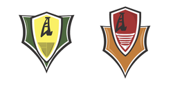
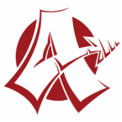
Day 14 - Sports Logo (Feb 20, 21) I can use professional logos to help me learn how to set up an organized drawing.
Day 15 - Sports Logo (Feb 24) I can use professional logos to help me learn how to set up an organized drawing.
Day 16-17 - Vector Drawing the Logo (Feb 25,26) I can create a well crafted logo that communicates something about myself. Work on personal logo drawing Day 18 - Workday (Feb 27) I can create a well crafted logo that communicates something about myself. Work on personal logo drawing Day 19 - DUE Date (Feb 28) I can create a well crafted logo that communicates something about myself.
Day 20 - Portfolio Workday (Mar 3) I can maintain a collection of my work that demonstrates my learning.
|
Notes:
These are the lessons and videos we go through in class to help you meet the goals and objectives above.
These are the lessons and videos we go through in class to help you meet the goals and objectives above.
Branding and Brainstorming
Branding is a marketing tool for establishing customer loyalty based on both emotions and rational actions. Branding, in essence, attempts to connect a company (and its abstract ideals it stands for) to a consumer. To do this, companies use marketing tools like print ads, jingles, color schemes, commercials. Among the strongest of branding tools are logos. Logos are intended to stand for the abstract ideas that a company represents.
Branding and Brainstorming Video: http://www.youtube.com/watch?v=tTaUz-qdXoU
Hand Drawing Process
Drawing by hand is a critical first step for many designers' work flow. A work flow is a series of steps that designers take to complete a task. These videos will help you work through your hand drawing that will eventually come to life on the computer.
Color
Color PowerPoint
Color Emotion Guide (from PowerPoint)
The Psychology of Color (PDF, from PowerPoint)
Kuler Website
Springboard Words - Branding Messages
The words below are words that companies might want you to associate with their company when you see their logo. Think of how Nike wants you to think of "speed" when you see their logo. Which of these words do you want your audience to think about when they see your logo?
The words below are words that companies might want you to associate with their company when you see their logo. Think of how Nike wants you to think of "speed" when you see their logo. Which of these words do you want your audience to think about when they see your logo?
|
Strength
Caring Familial Warmth Rage Forceful Respectful Accuracy Cooperation Progress Self-reliance Charm Duty Resourcefulness Willingness Vigorous Affectionate Fame Nerve Piety Intellectualism Cleverness Conviction Sneaky Leadership Purity Authority Rigor Serenity Temperance Security Ambitious Bravery Truth |
Flexibility
Gratitude Heroism Health Agility Compelling Docile Intelligence Assertive Practicality Community Merit Vision Independence Efficiency Tranquility Vivacity Creativity Excellence Skillfulness Service Change Artistic Gratitude Structure Sacred Courteousness Hilarious Carefulness Adventure Expertise Wisdom Flair Realistic |
Integrity
Audacity Virtue Elegance Energetic Discovery Harmonious Freedom Privacy Playful Relaxed Competence Simplicity Effectiveness Joy Neatness Judgment Brilliance Fashionable Justice Reserved Deep Powerful Modest Fair Peacefulness Honor Committed Patriotic Competitive Furious Clumsy Influential Cheerfulness |
Excellence
Thoughtful Teamwork Variety Unity Concern Tender Gentle Meek Helpful Compassionate Cleanliness Beauty Sensitive Utility Valor Cold Charisma Delight Dependence Sincere Cordial Wild Availability Strong |
Grading Information
Final Logo
Your final vector logo sticker will be graded using the following rubric. You will earn a score of zero through four. Zeroes are rare, but a grade of zero may be assigned in any of the categories for not complying or for not presenting any evidence of the standard. A penalty of two percentage points will be deducted from the final score for each day the project is turned in late.
|
Creativity
Through extensive research & brainstorming, the student brings creates a project that is unique, innovative & original. Ideas are explored through uncommon imagery. The logo is unique & highly personalized. Common Creativity Problems
4 = Totally unique design. No letters or symbols are copied from existing logos or fonts. The logo goes beyond an illustration of interests & conveys the abstract values of the student. Visual clichés & schema are avoided. 3 = May have some common imagery w/o much variation - may lack a symbol or lettering, may not be very personalized. May be too reliant oncliché or schematic symbol. 2 = Schematic symbol w/ minimal addition or variation. Font may be overly simple w/ little or no personalization. 1 = Little done to vary from existing symbols, schema, or typefaces. |
Craftsmanship
Exhibits care and attention to detail. Parallels & perpendiculars correctly drawn. Curves are smooth & even – not created by many straight lines. Student avoids using too many or too few points when drawing paths. No hairline gaps, jagged paths, stray or misplaced points. File is in RGB color format. Common Craftsmanship Problems
4 = Standards are all met exceptionally well. 3 = Very few standards are missed. Some parallels or perpendiculars may be slightly off. Curves are still smooth and even. There are no hairline gaps. Color mode may be CMYK. 2 = Some curves might be jagged, but not all. May have some hairline gaps or misplaced points resulting in awkward paths (especially at direction changes). May have several off-parallel or off-perpendicular paths. 1 = Paths are jagged – curves not used. There may be several hairline gaps. |
Composition/Use of Color
Colors chosen to complement each other. Careful consideration of the color theories presented in class is evident. Colors help communicate central idea of the logo. Gradients and flat color areas used when appropriate. Colors are not overly saturated. Common Composition/Color Problems
4 = Standards are all met exceptionally well. 3= Some parts (but not all parts) of the logos may have over-saturated colors. Colors may not communicate meaning very well. 2 = Color is inconsistent (i.e. – there are different reds or different blacks). Colors may be over-saturated throughout. Colors do little to communicate meaning. 1 = Colors are over-saturated. Colors that should be same may not match. Colors not chosen for meaning. |
Visual Communication
Entire image communicates a central theme that is planned prior to the creation of the logo. The theme is understood by the viewer w/ no extra details that do not add meaning. The idea is communicated solely through imagery; text is only for support. Common Communication Problems
4 = Evidence of a single, central idea that is demonstrated without cliché images 3 = An interest, hobby, or activity is likely the most visible symbol. Abstract values are still considered in the design. Symbols may be cliché or communicate an overly simple concept. 2 = Imagery is chosen for visual quality rather than communication of a value: may be primarily an illustration of an interest or activity. 1 = Central idea is not communicated by chosen symbols, central idea is too difficult to discern |
Other Grades
The final logo drawing is the big project grade for this unit. However, there are other smaller grades that will occur.
Daily Grades (smaller assignments)
Sports Logo
Reflection
Sketches
Portfolio Check
Lab Grade
Back to the top
The final logo drawing is the big project grade for this unit. However, there are other smaller grades that will occur.
Daily Grades (smaller assignments)
Sports Logo
Reflection
Sketches
Portfolio Check
Lab Grade
Back to the top
Reflection
Read the passage below and answer the questions at the end. Type this in Microsoft Word or another word processing program so you can take advantage of spell check and grammar check. Spelling and grammar will count in the assessment of your writing. Refer to the grading section above to see how the writing will be graded.
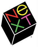
In 1986, Steve Jobs found himself pushed out of Apple and the founder of a new computer company called NeXT. Steve Jobs hired the legendary Paul Rand to create a logo for the company. At first, the two creative people had a comical (in hindsight) interaction that Jobs described to his biographer Walter Isaacson:
Read the passage below and answer the questions at the end. Type this in Microsoft Word or another word processing program so you can take advantage of spell check and grammar check. Spelling and grammar will count in the assessment of your writing. Refer to the grading section above to see how the writing will be graded.
In 1986, Steve Jobs found himself pushed out of Apple and the founder of a new computer company called NeXT. Steve Jobs hired the legendary Paul Rand to create a logo for the company. At first, the two creative people had a comical (in hindsight) interaction that Jobs described to his biographer Walter Isaacson:
"I asked him if he would come up with a few options. And he said, ‘No, I will solve your problem for you, and you will pay me. And you don’t have to use the solution — if you want options, go talk to other people. But I’ll solve your problem for you the best way I know how, and you use it or not, that’s up to you — you’re the client — but you pay me.” – Steve Jobs
Paul Rand went on to design that NeXT logo along with a 100-page document describing his process in extreme depth. That document, and others he created in his career, is an amazing look into the way an artist thinks. Here is an excerpt from that document that describes the look of the NeXT logo:
“In its design, color arrangement, and orientation, the logo is a study in contrasts. Tipped at a jaunty angle, it brings with the informality, friendliness, and spontaneity of a Christmas seal and the authority of a rubber stamp. Together with its lively, black silhouette it becomes a focal point difficult for the eyes to avoid.
The unconventional, yet, dignified, array of colors: vermilion against cerise and green and yellow against black (the most intense color contrast possible) is designed to appeal to a youthful audience and to add a sparking, jewel-like touch to paper, package, or machine. It is the sparing use of brilliant colors on a predominantly black ground that produces this effect, like stars in the sky. In itself, a decorative and self-contained device, the logo does not depend on extraneous embellishment or fancy backgrounds for its many varied applications.
Poised at an angle of twenty-eight degrees, the black cube – even without color – is equally effective for black and white use.” – Paul Rand
Writing Prompt:
Use Mr. Rand’s detailed description as an inspiration as you tell me more about the visual cues used in your own logo. Why did you choose each detailed piece of imagery? What are the objects contained in the image and why are they drawn the way they are drawn? Why did you choose the colors your chose? What other visual choices did you make?
Please write in a minimum of two solid paragraphs of text (no intro or conclusion). The more detail you include, the better. You must describe each object, detail, color, and font used in your image along with a description of its purpose in communicating something about yourself. Correctly use a minimum of five vocabulary words from the project sheet in your reflection.
Back to the top
